Hi I’m Manda!
I’m a Product Designer who thrives on creating beautiful, functional products and working alongside brilliant teams. Whether flying solo or collaborating in fast-paced environments, I’m always expanding my skills and pushing my creative boundaries.

About Me
I’ve been designing for the web since my teenage years, when I first discovered the magic of the internet. During college, I worked at a high-volume print shop, learning all about the print industry and how I fit into it as a designer. Graduating cum laude from Texas State University opened the door to some incredible opportunities.
Throughout my career, I’ve worn many hats: working solo on projects, collaborating with fast-paced, multidisciplinary teams, and even leading a design department, where I hired and managed junior designers, interns, and photographers.
After a few years of freelancing and contracting, I realized I was missing that sense of community. It turns out, I thrive on collaborating with brilliant minds to create beautiful, useful products, while constantly growing as a designer. Who knew?!
I am a firm believer that everything is figureoutable, whether it’s a deep-dive on Google or an online course. And when I’m not enjoying one of those favorite things below, I’m probably dreaming up some more cute items for my shop!
My Favorite Things
Longtime Passion


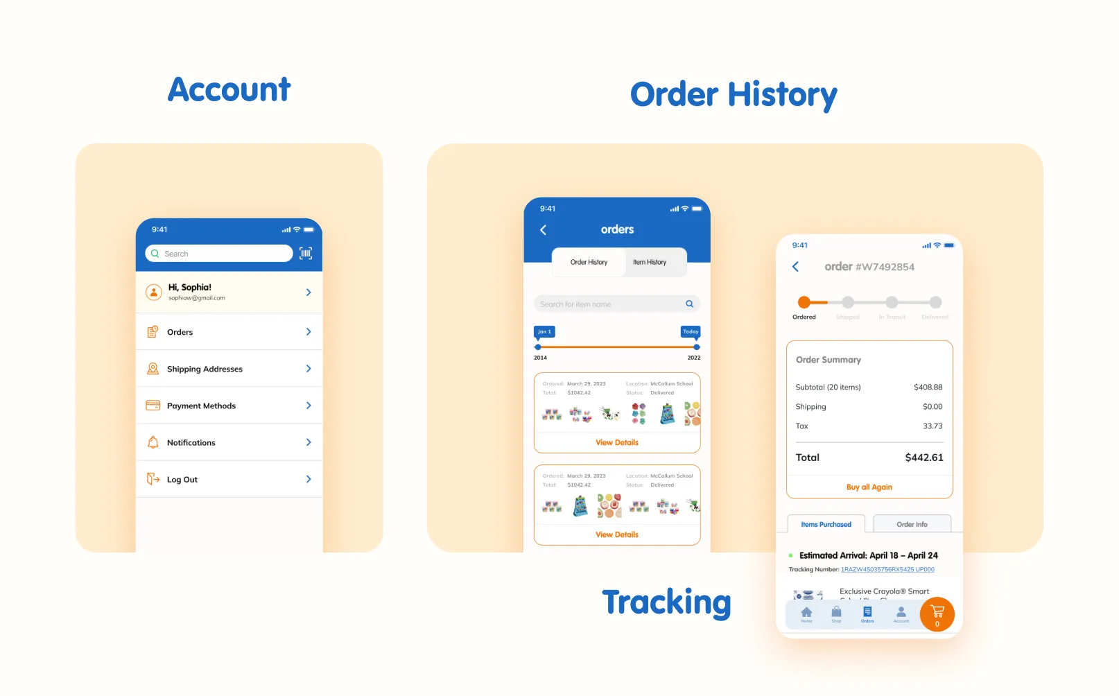
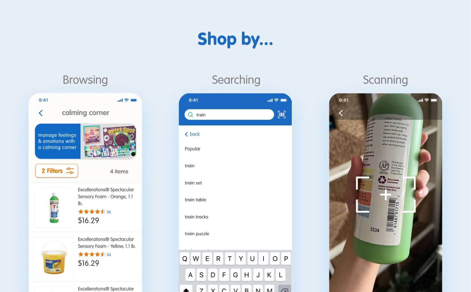
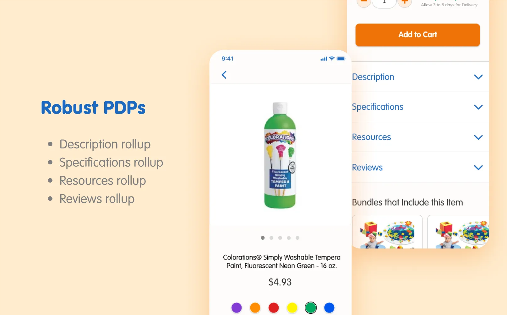
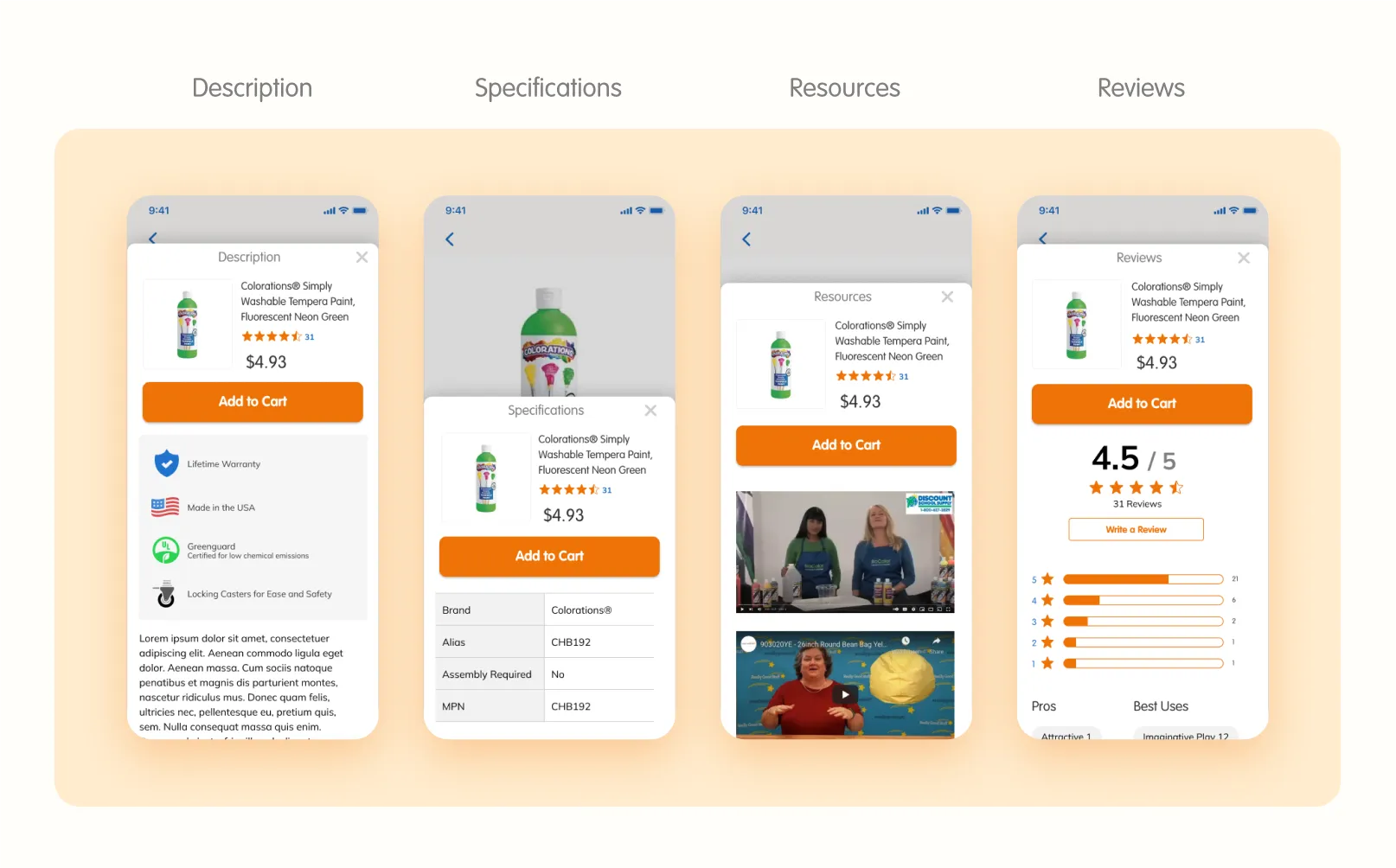
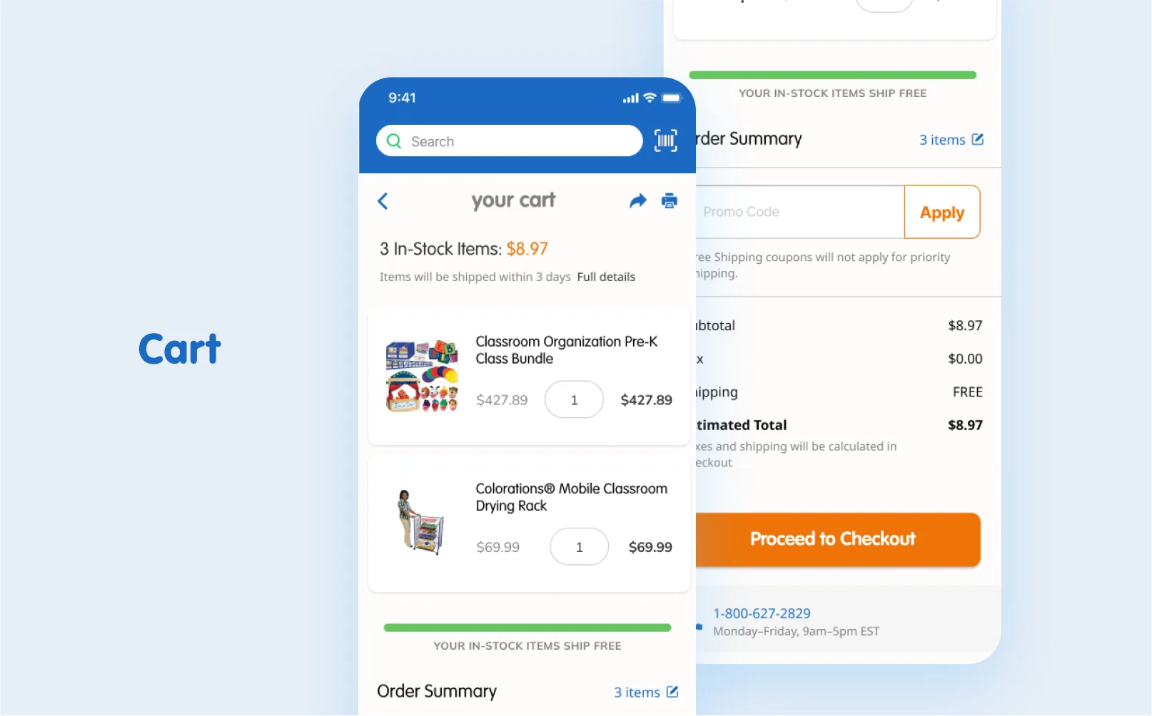
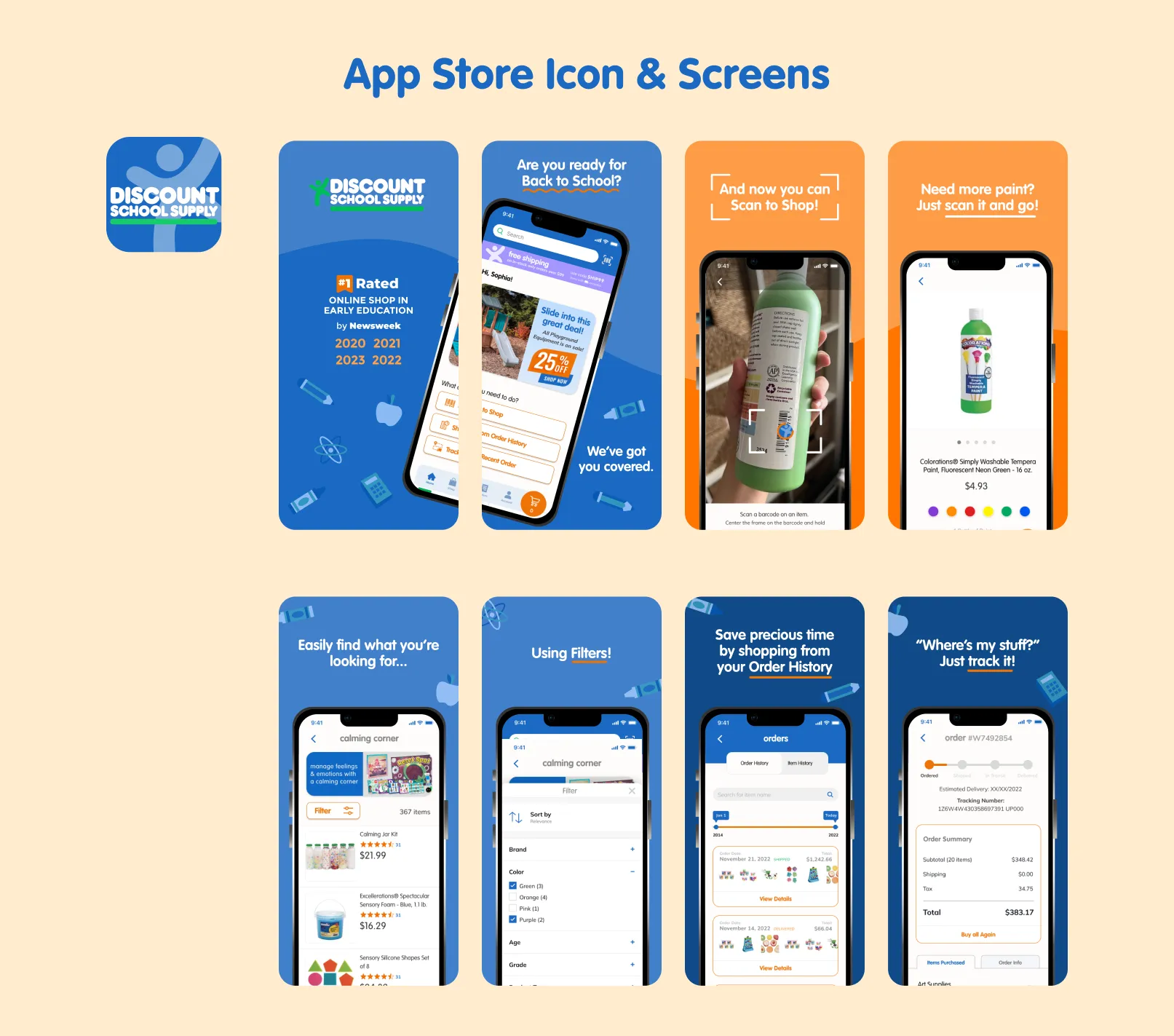
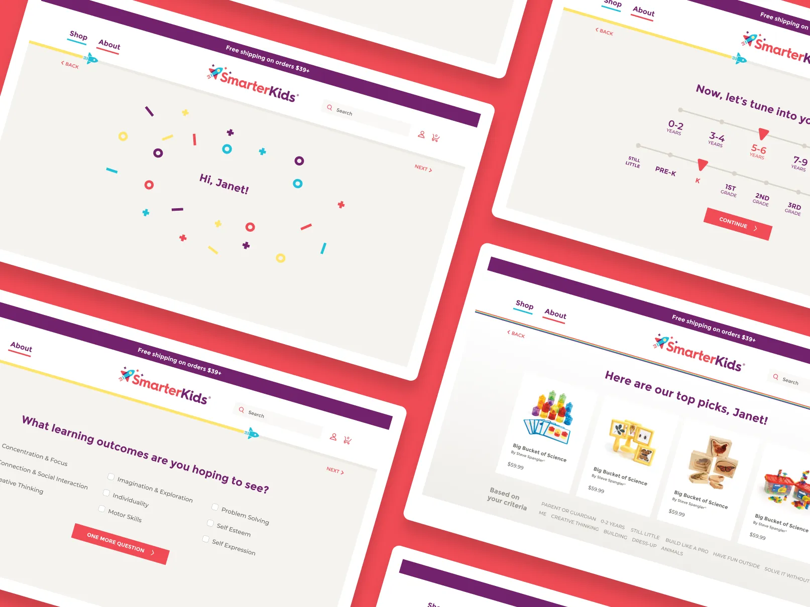
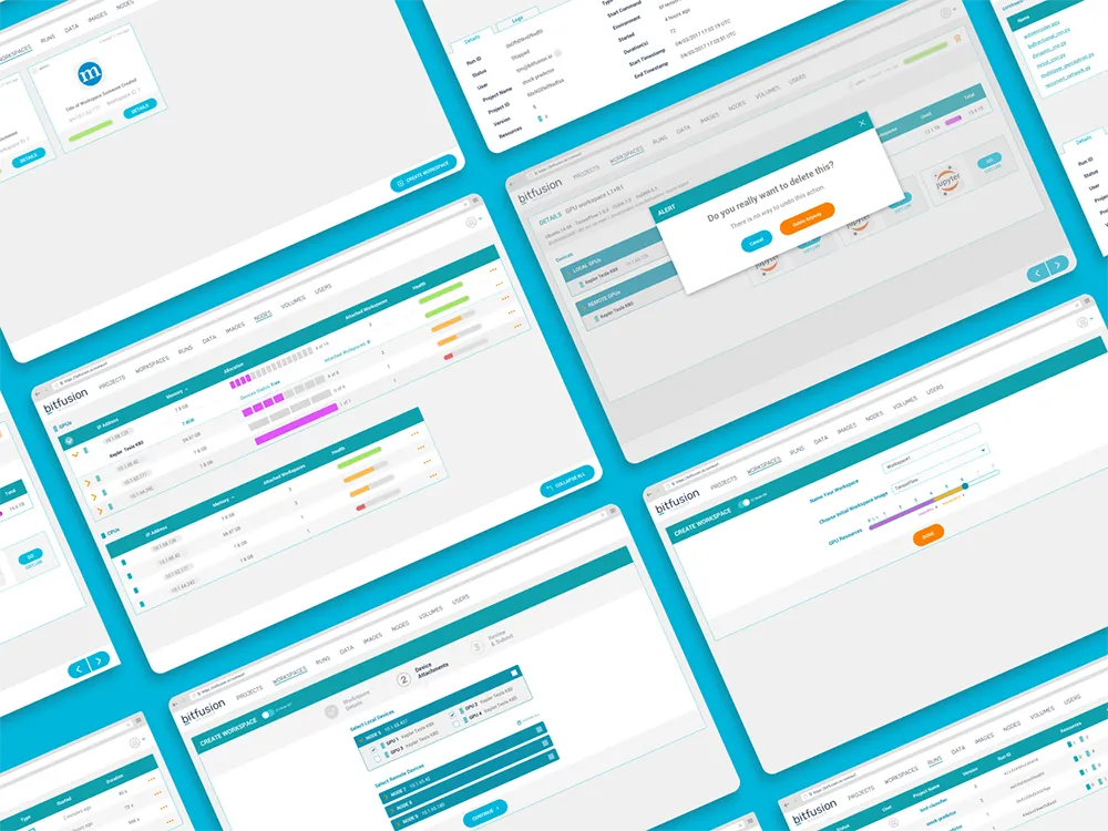
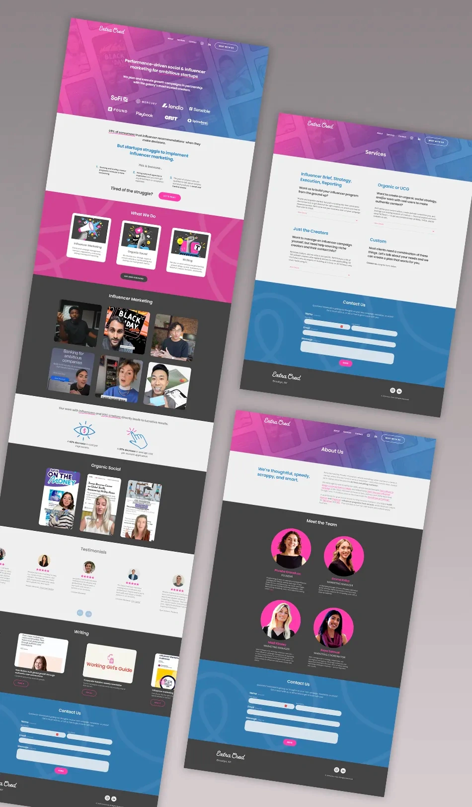
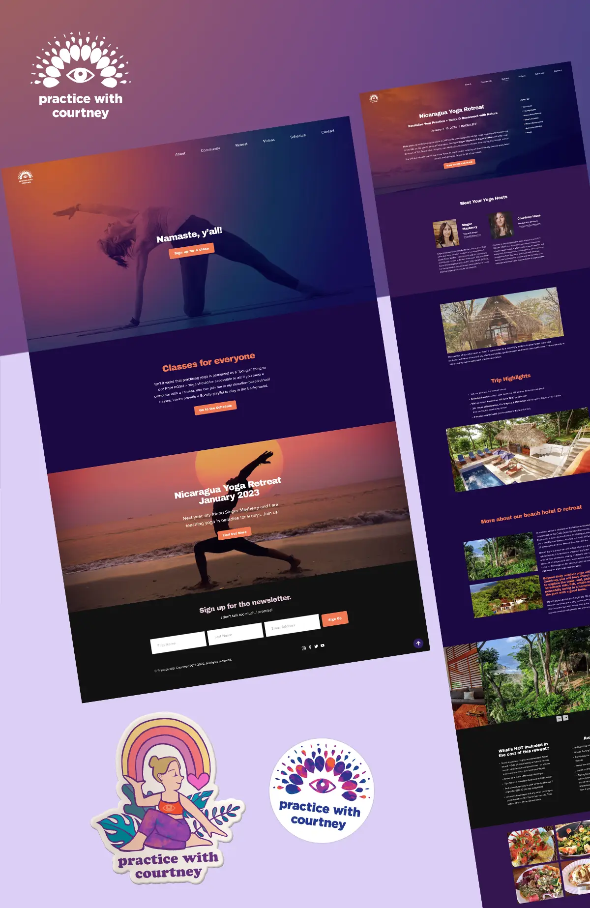
Product Design
Designing for web, mobile, and beyond!


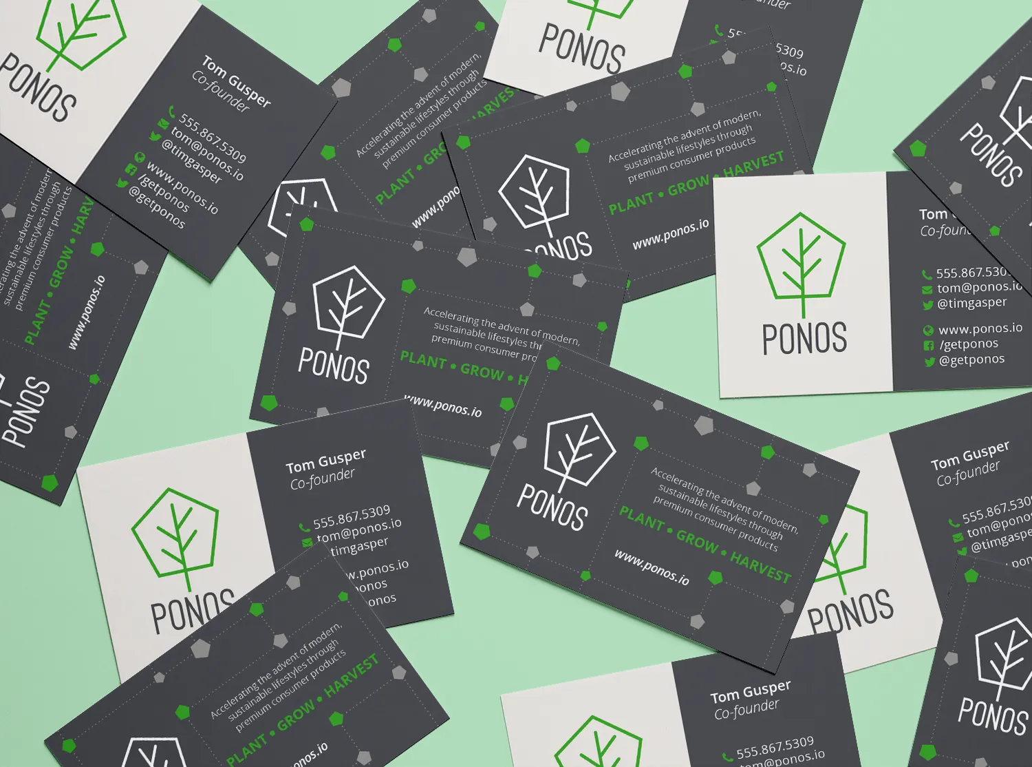
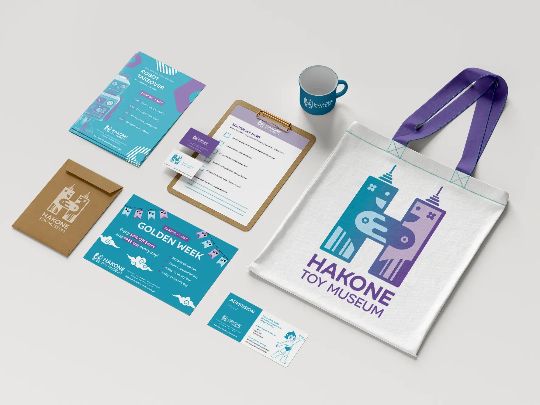
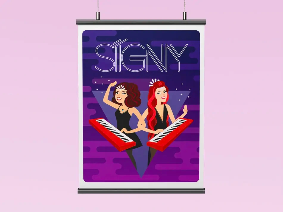
Branding
Logo Design, Identity Work, and Social Media


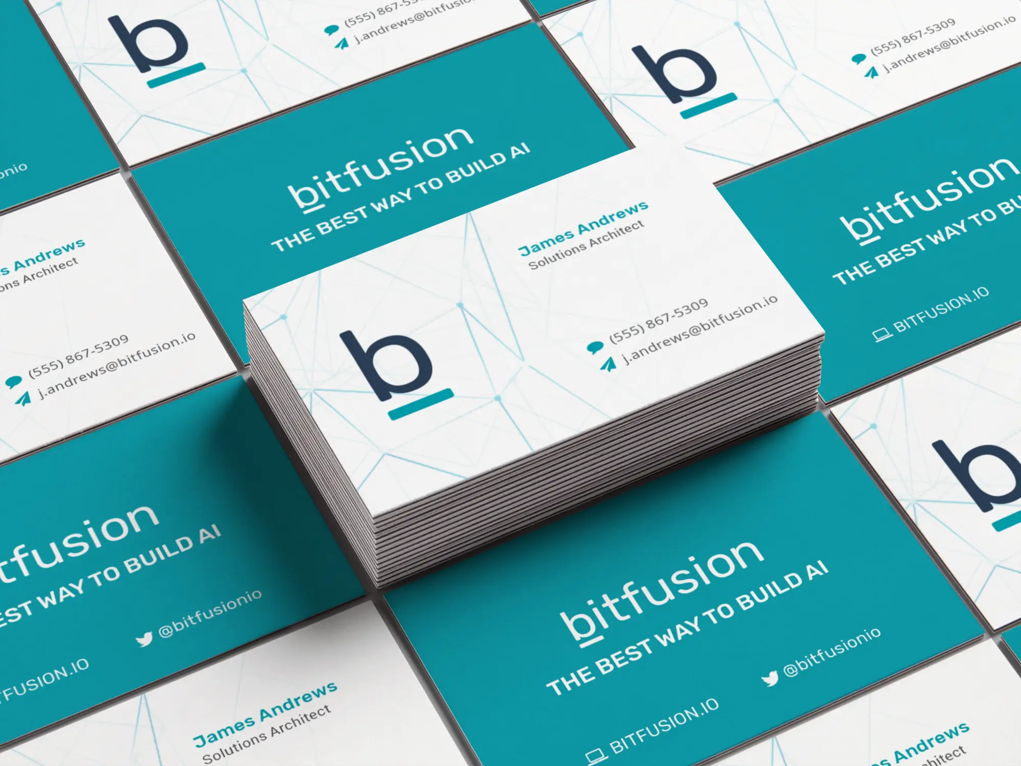


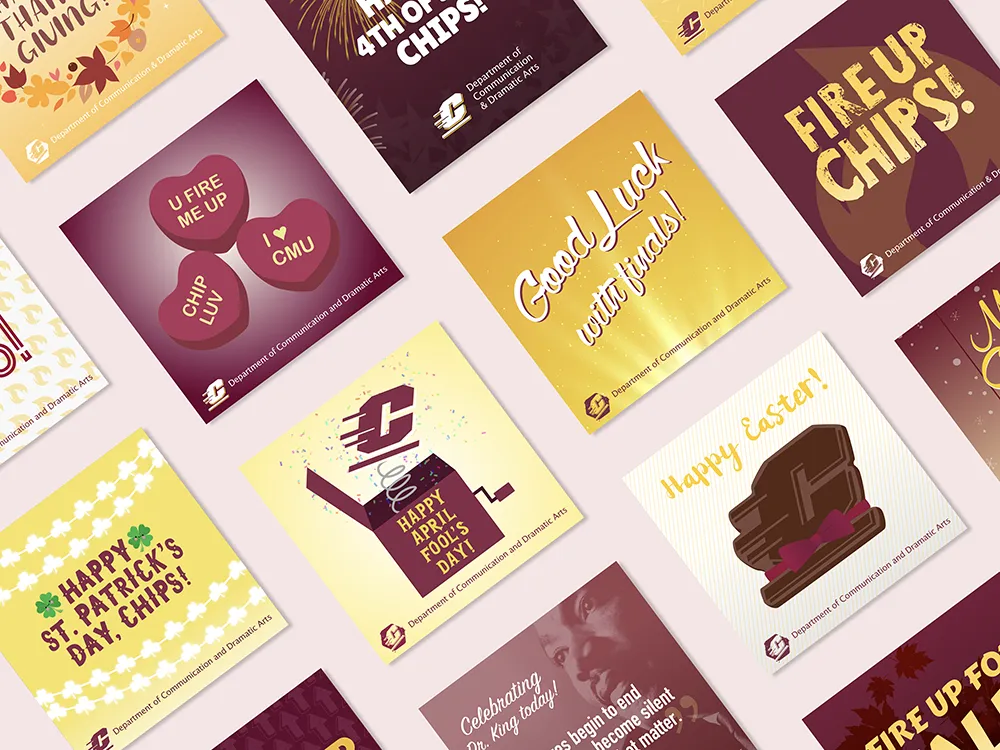


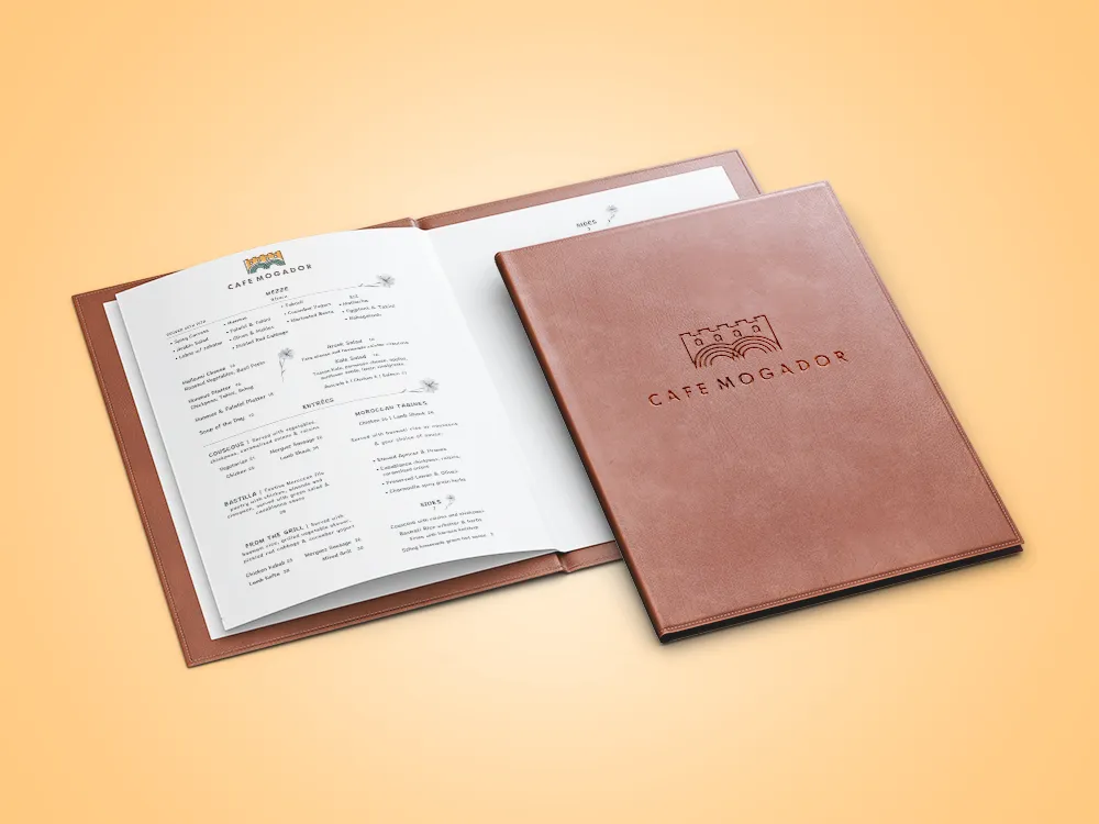
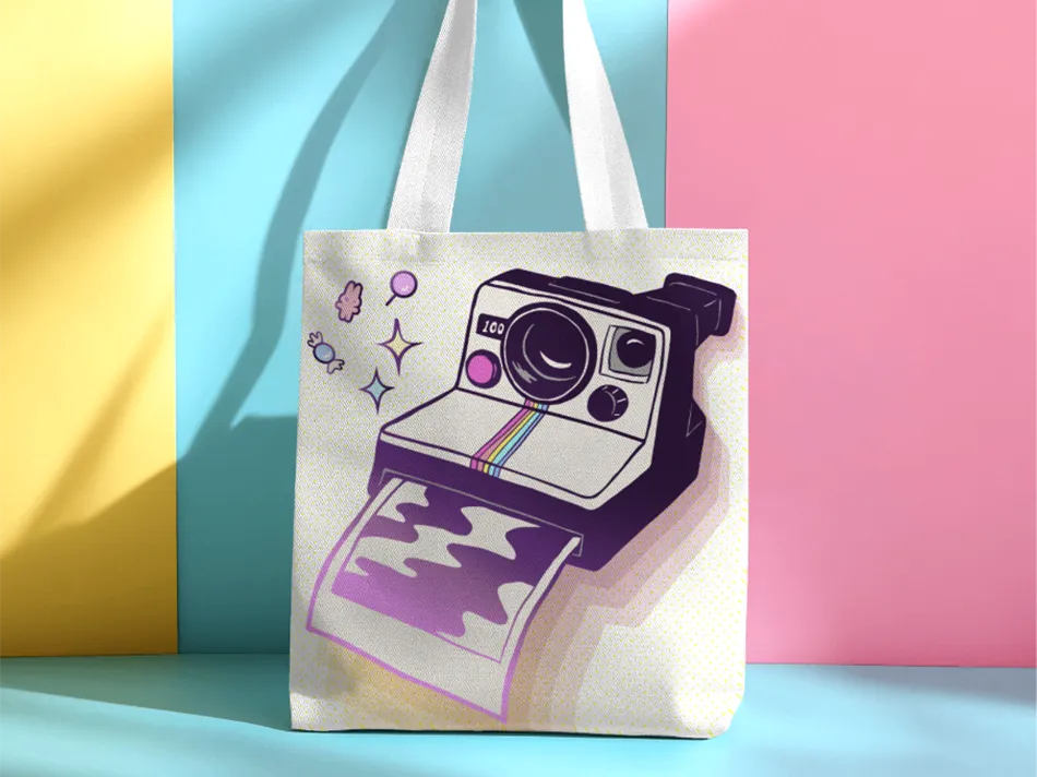
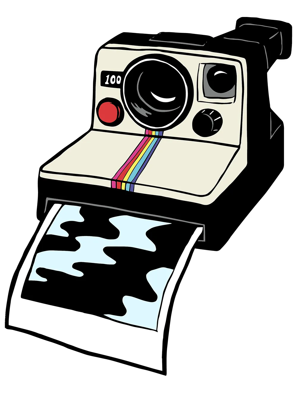
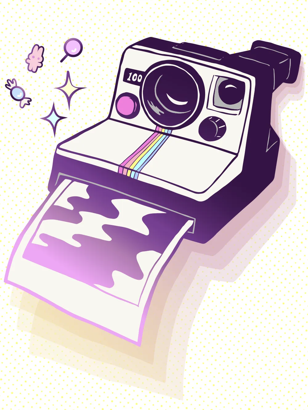
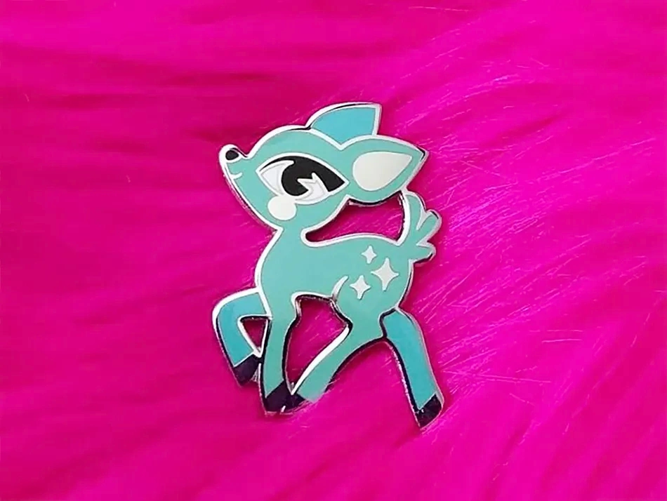
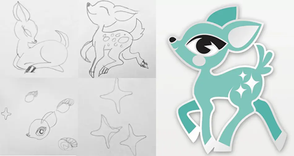
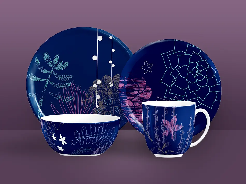
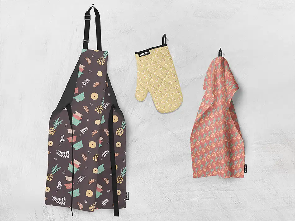
Producing print projects is my PAPER jam!


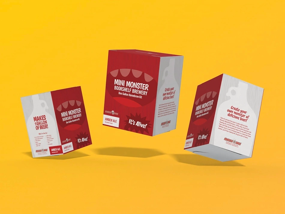

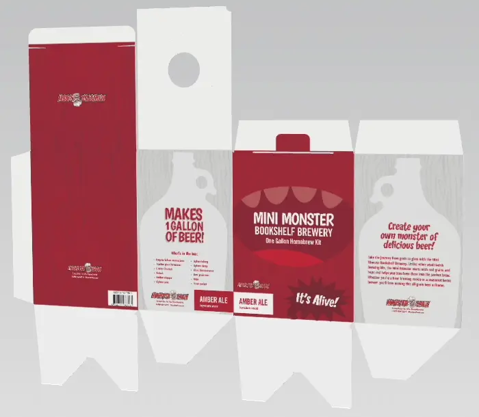


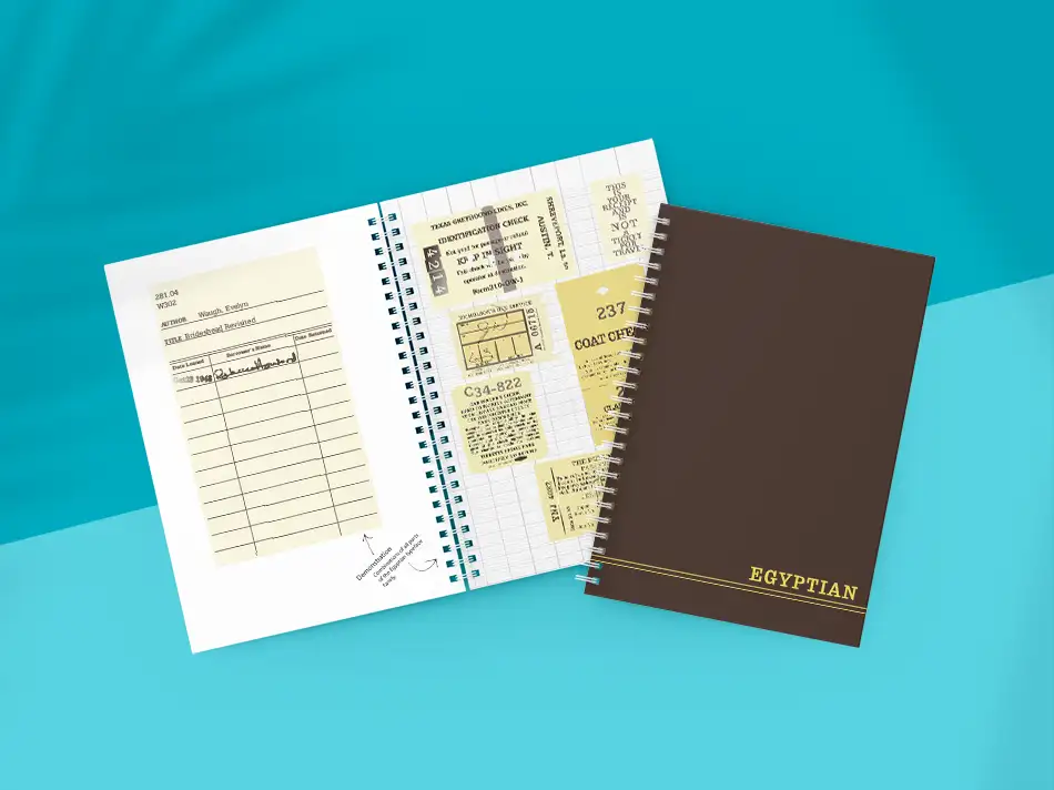
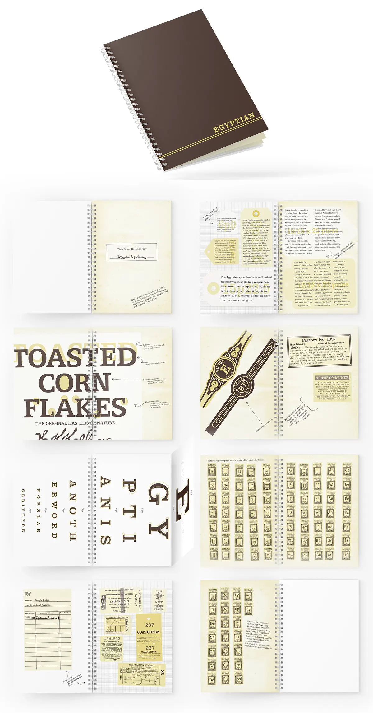

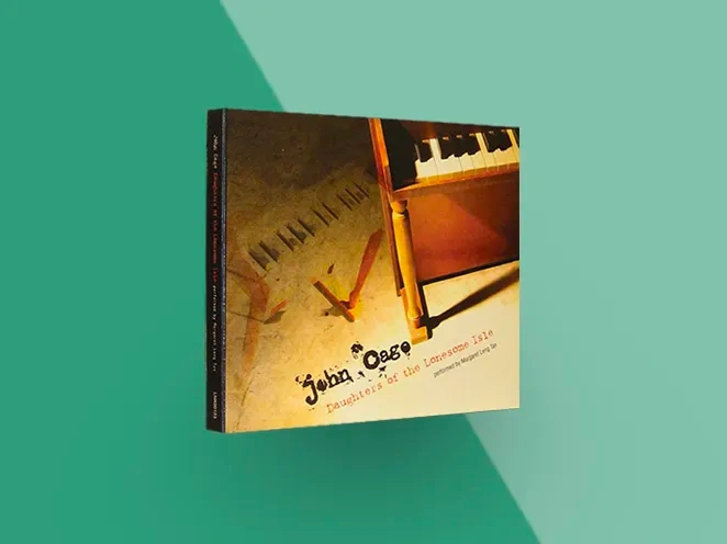
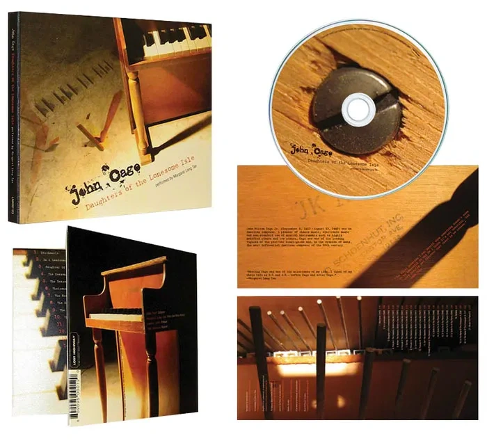
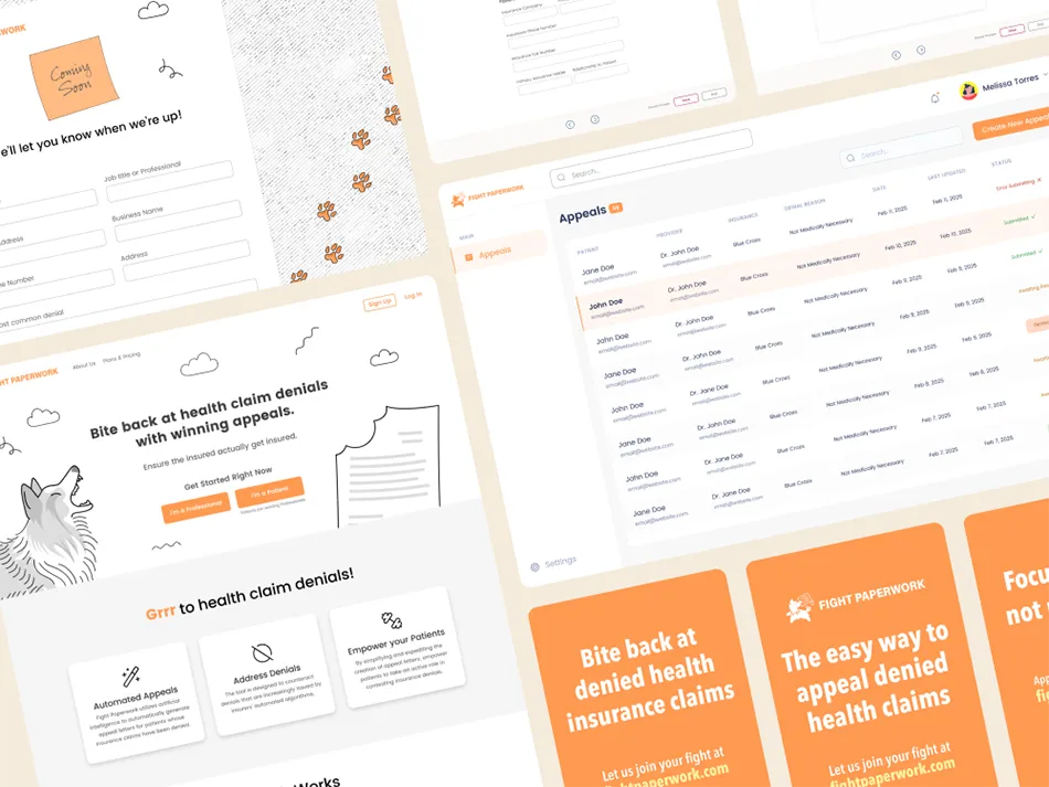
In addition to client work, I run an online shop for prints, pins, and patches.
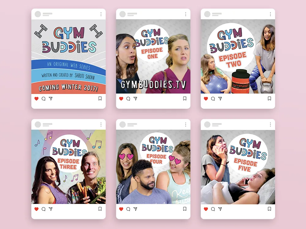
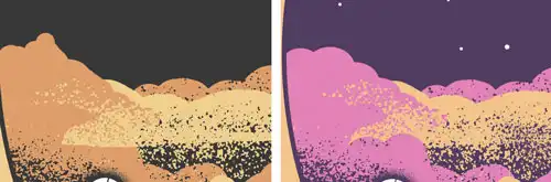
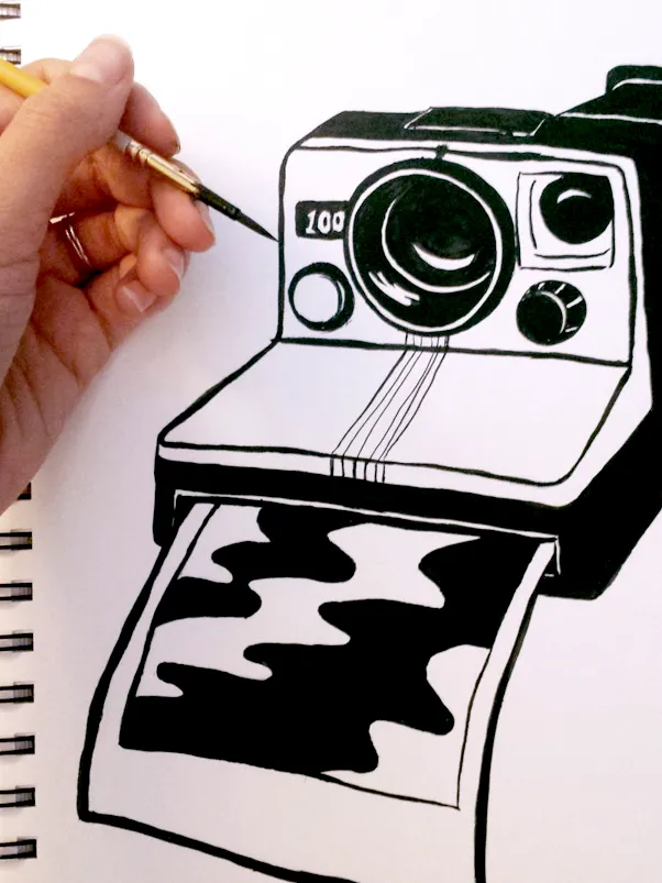
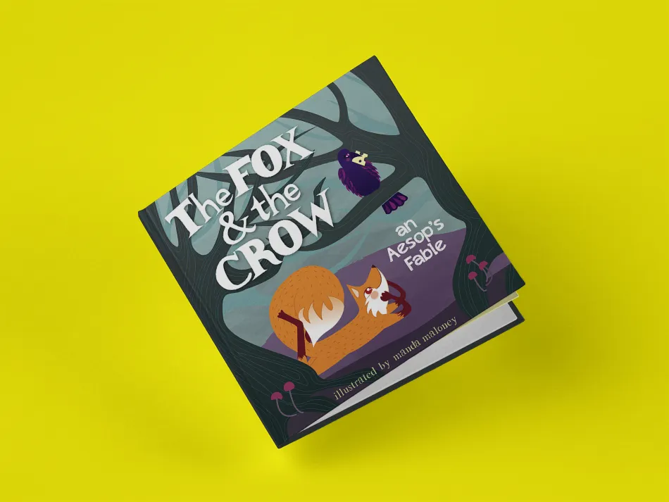
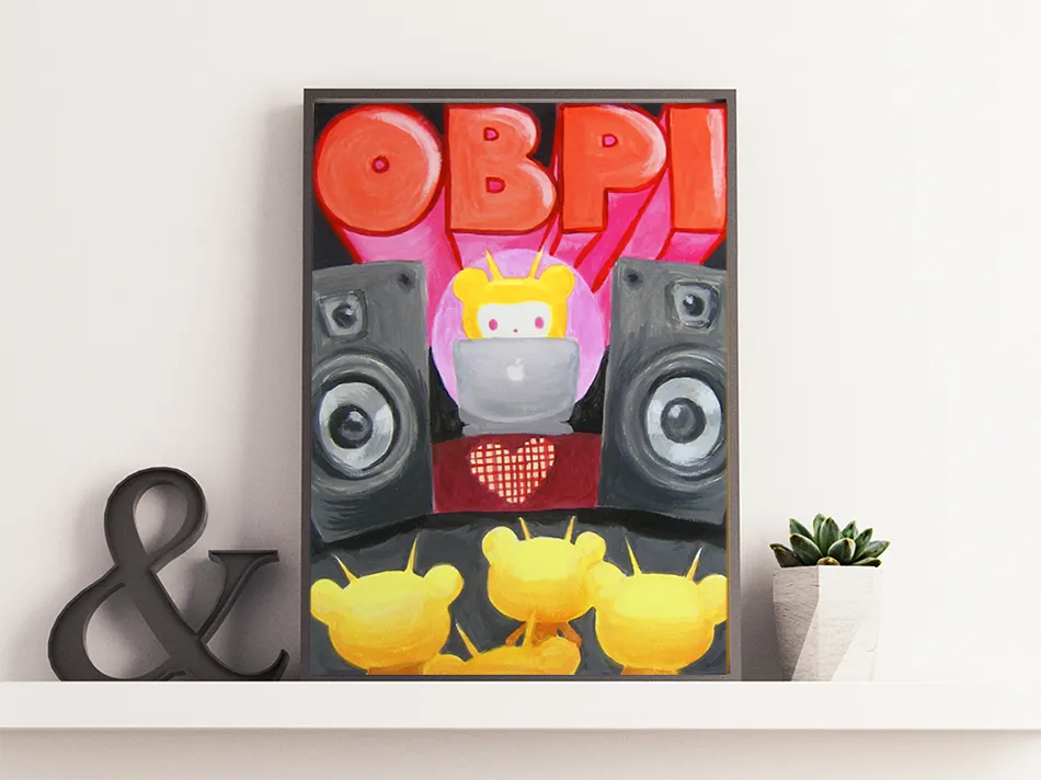
Illustration


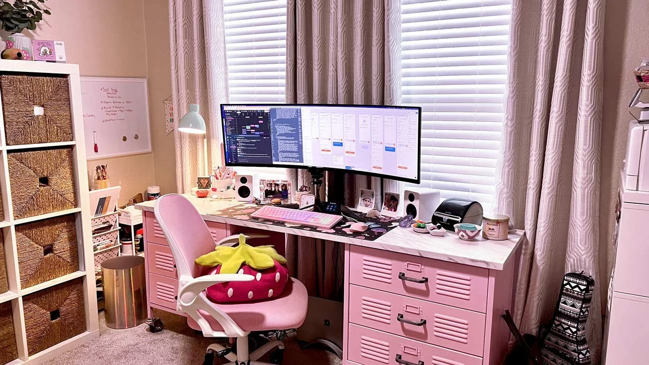
Step into my office.
What can I do for you?
Got an idea brewing? A project you’re excited about? Or maybe you just want to say hey! Whatever’s on your mind, I’d love to hear it. Drop me a line, and let’s fan that spark into a flame!
Aw, you guys!
-
![]()
★★★★★
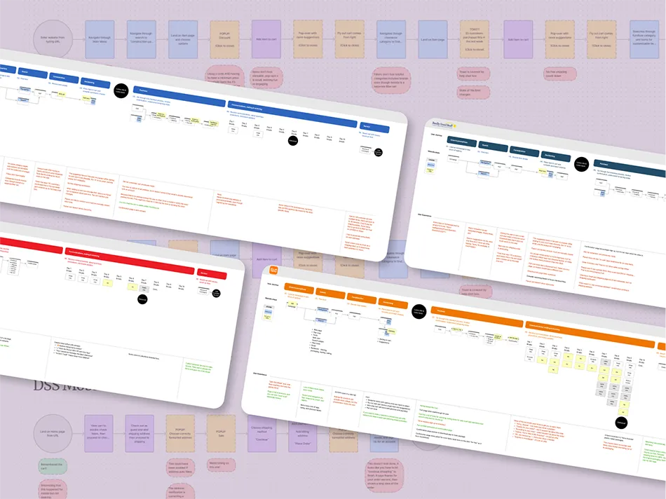
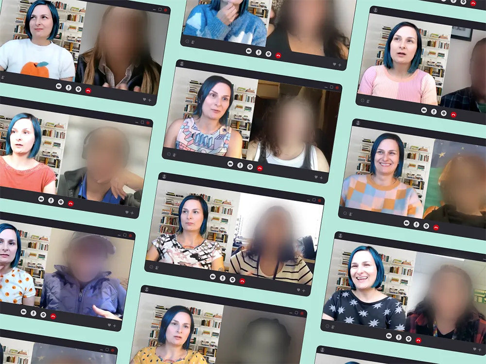
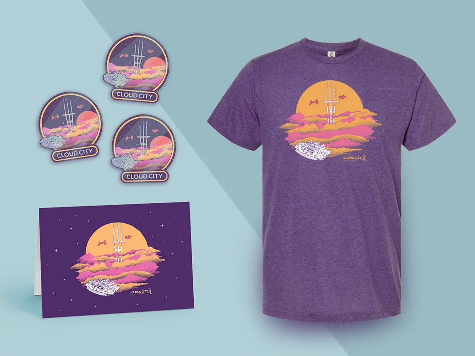
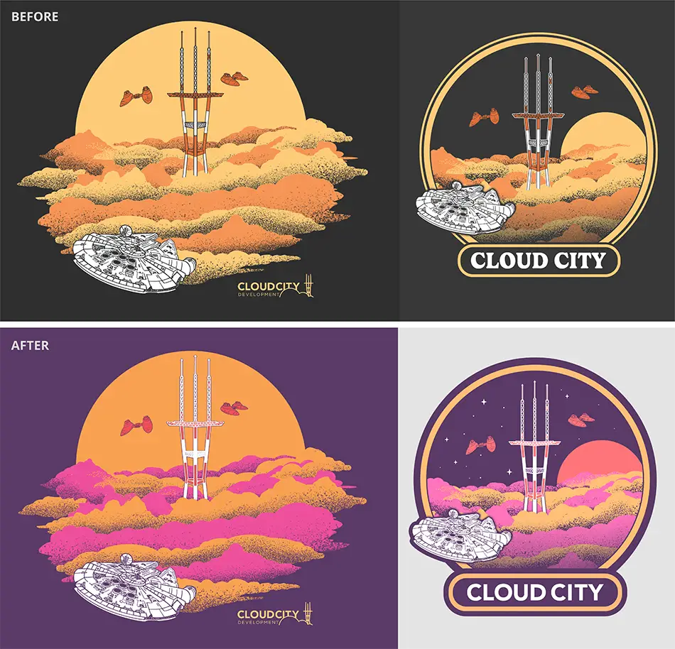
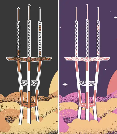
“I had the pleasure of working with Manda at Cloud City Development, where she consistently stood out with her positive energy and passion for her work.From user research and competitor analysis to prototypes and polished designs, Manda delivered exceptional work on time and ready for development. One standout moment was her creation of an atomic design system for an e-commerce giant, built on thorough research and months of interviews.
Manda has a rare talent for building connections, whether with clients or users. She conducted hundreds of interviews with a perfect balance of empathy and impartiality, ensuring the best insights every time.
Manda is a true powerhouse—a full-stack designer who excels in both research and flawless visual execution. She eagerly embraced any design challenge or team-building opportunity we threw at her. I’d jump at the chance to collaborate with her again—any team would be lucky to have her!”
Brendan Miller
former Principal Designer at Cloud CIty Development -
![]()
★★★★★
“I am a New York-based actress who hired Manda to redesign my business cards, post cards, and website. Going above and beyond the call of duty, she spruced up my resume as well.Ease of communication, professionalism, and a true artist's eye for design make working with Manda a dream. She was prompt. courteous, and the finished products look fantastic. I love that she wasn't afraid to tell me it was time to update my old, amateurish fonts.
My marketing materials look fresh, modern, consistent, on-brand, and most importantly, reflect my personality and aesthetic. My site has never looked so fly! I would highly recommend Manda to anyone looking to take their marketing to the next level. She makes you look like a true professional.”
Charity Schubert
SAG-AFTRA/AELA -
![]()
★★★★★
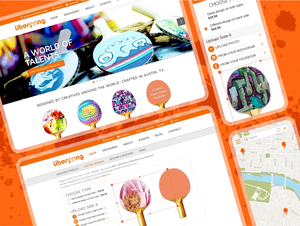
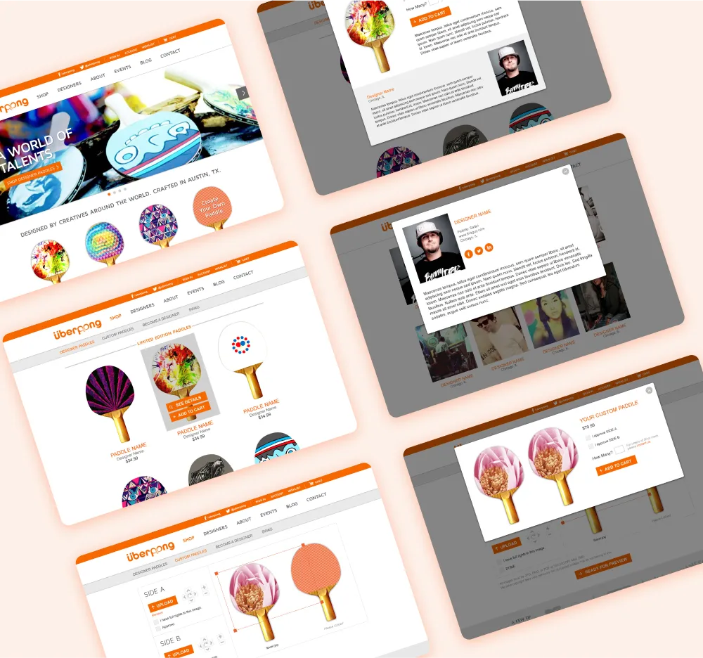
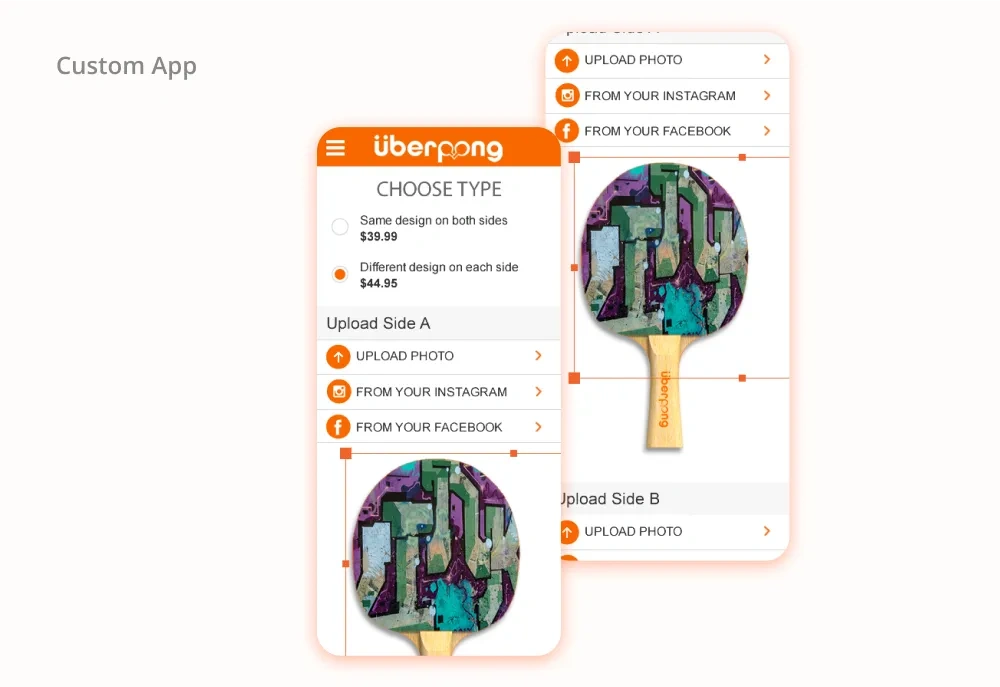
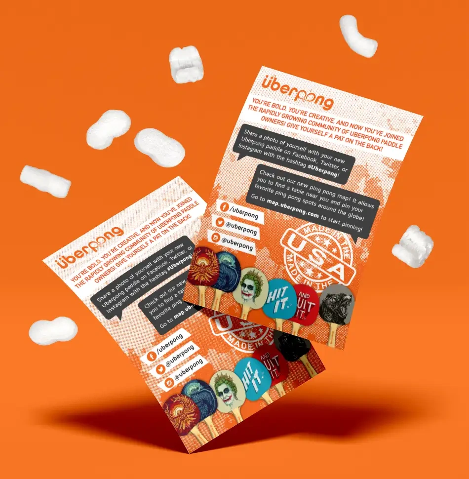
“I supervised Manda during my time as Creative Director at the Austin startup, Uberpong, Initially accepting the role as Visual Designer, Manda has surpassed any expectations we initially had when we set out to expand our team. Utilizing her talent and knowledge, she was able to expand our design team's capabilities through her deliverables and management skills.Throughout her time at Uberpong, Manda was able to wear multiple hats a trait that is becoming more and more necessary within the design field. Not only do I recommend Manda for any Senior UX Designer role, but should you add her to your team, you will see exponential growth in your team's talent and capabilities.”
Mark Schnitzer
former Creative Director at Uberpong -
![]()
★★★★★
“With a bright attitude and unending knowledge of design trends, Manda made an excellent design partner in the two years we worked back-to-back at BancVue (now Kasasa). She was always available for collaboration and brainstorming, and had a skill for thoughtful, constructive critique. She treats her coworkers like teammates; sharing ideas and techniques to improve the team as a whole, finding success in other people's achievements.In addition, I admire her drive and enthusiasm for continued learning. Now whenever we speak, she is telling me about a new class, book, or tutorial she is taking to further expand her skill set. Any company would be lucky to have such a strong designer and collaborator on their team.”
Casey Taylor
former Sr. Visual Designer at Bancvue/Kasasa