
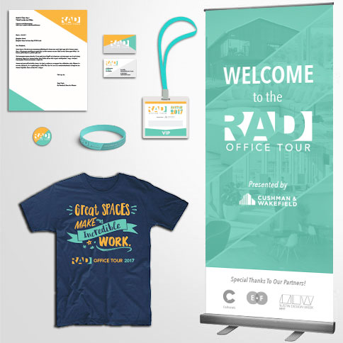
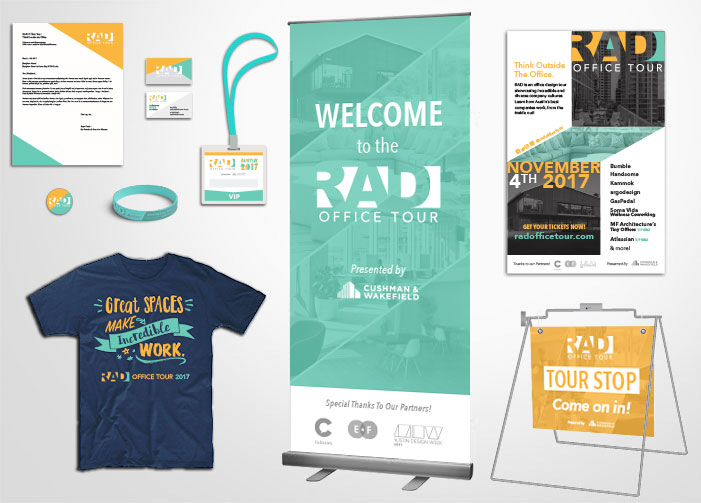
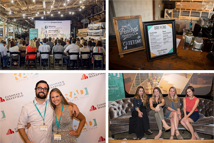
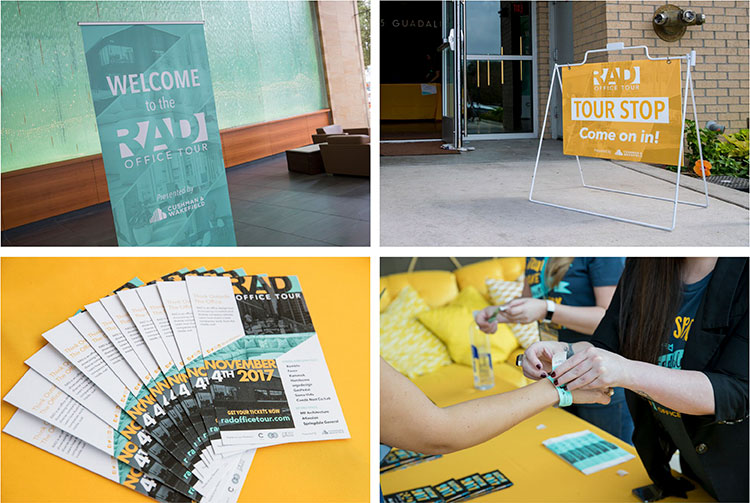
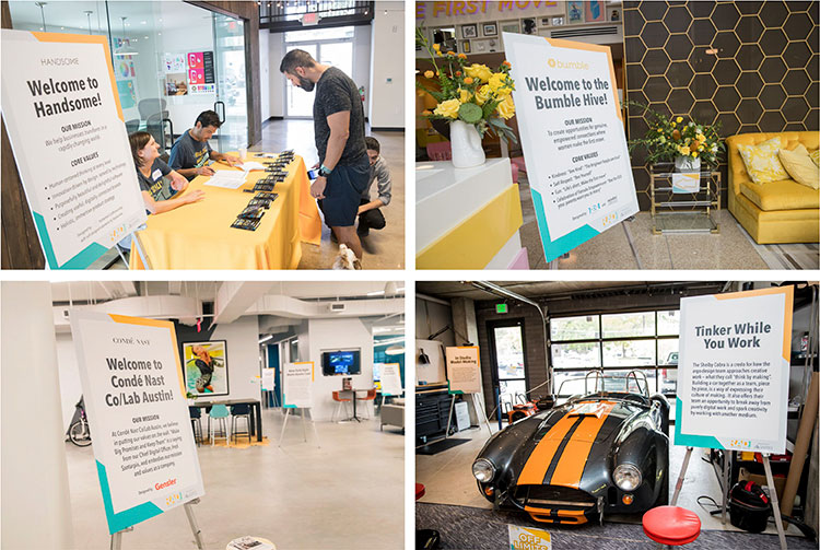
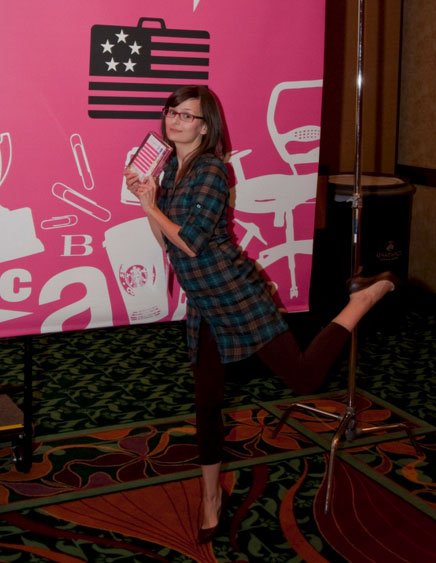
As the Creative Director for this event, I was in charge of all web & print material, which included designing and producing all signage. [PHOTOS]
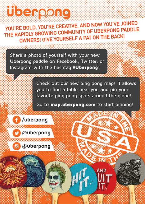
Flyer that customers get when they receive their order. Call to action for this one is to share a photo of yourself on social media.
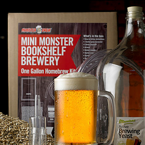
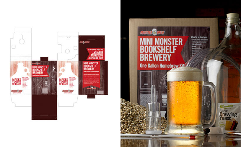
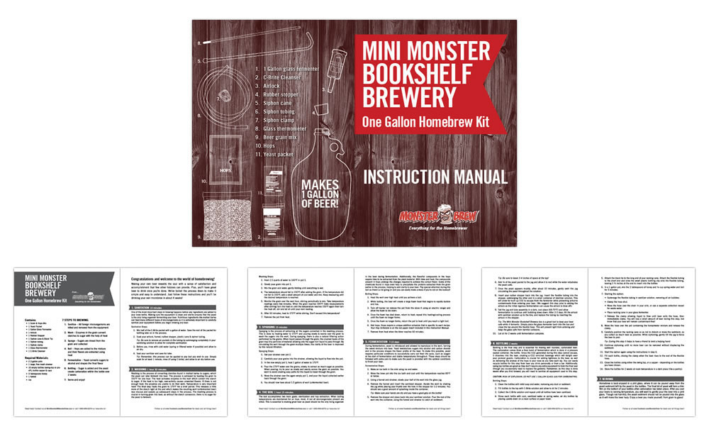
Packaging & instruction booklet for this homebrew kit by Monster Brew. I also art directed the photoshoot for that photo.
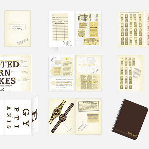
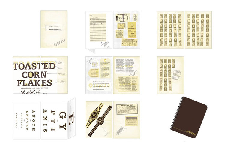
Type catalog for the slab typeface Egyptian using an Ephemera Scrapbook theme. All text seen here is strictly in the Egyptian typeface.
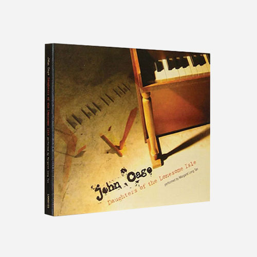
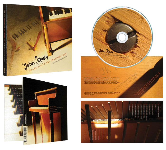
Album package for a John Cage compilation inspired by a vintage toy piano (which was actually my sister's). I did all the photography as well.
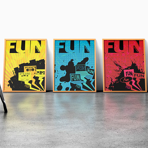
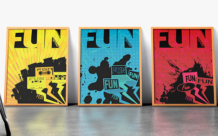
Posters for the 3rd annual Fun Fun Fun Fest, which had three stages at the time. I explored typography & patterns to communicate how each genre feels.